Design, maintenance and govenernance for the Secure Site Figma library used by over 51 teams. Refactored over 220 components with documentation and testing.

Client
Vanguard
Domain
Personal Investing
Duration
Q1 2026-Q4 2026
Scope
Design library
Overview
Vanguard’s Personal Investors secure site uses a family Figma library branched from Constellation, Vanguard’s enterprise design system. The Secure Site library was built quickly, without formal planning, to meet immediate product needs. Over time this led to inconsistencies, bloat and missing documentation. That was a critical bottleneck because 51 teams across the organization relied on it, so it needed a major overhaul and ongoing maintenance.
Challenge
As Design System Librarian for the Personal Investors secure site, I was responsible for its governance, refactoring, maintenance, testing and documentation. I worked closely with design, engineering and the Constellation team, so the library stayed reliable for the design, product and engineering teams who used it.
Responsibilities:
Keep the Figma library lean and well-structured so designers could rely on it every day.
Build a governance model and checklists for designers to follow when creating, refactoring or deprecating components.
Keep the family library aligned with Constellation.
Audit inconsistencies and close the gaps step by step through proposals, reviews and documentation.
Create reusable AI skills to speed up component testing and documentation.

Library structure
Key activities
Audit
I audited the Secure Site Figma library by reviewing every component, variant, property set and naming convention. The goal was to understand where the library stood and how far it had drifted from Constellation standards. From there, I put together a comparative analysis and a set of recommendations to get the team aligned.
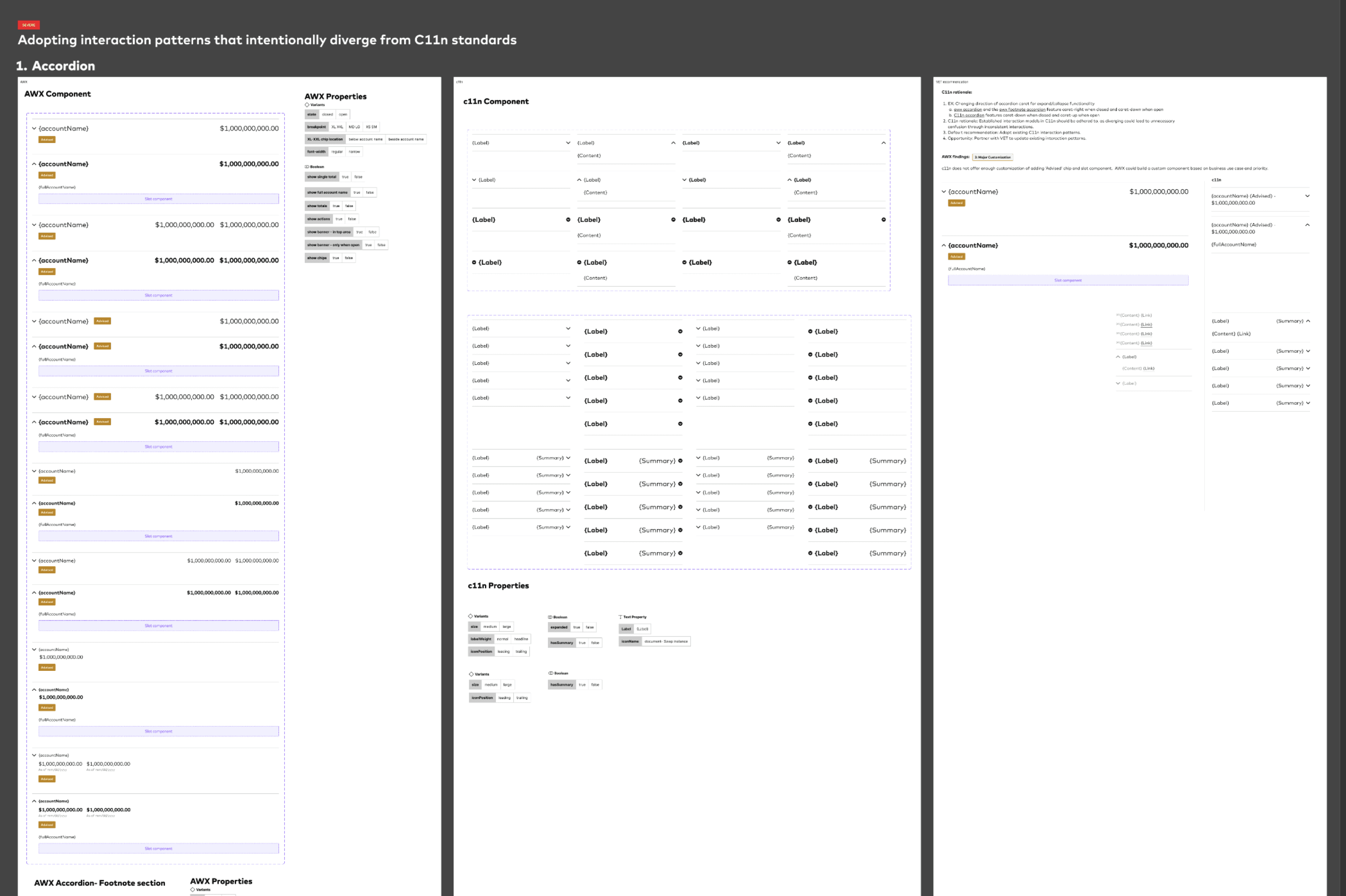
Component audit, comparison and findings
Governance
I created an actionable checklist, reviewed by the Constellation team, that set up a clear contribution model for the Secure Site library, with guidelines for change management and documentation. It started as a static checklist in Figma and grew into an interactive one that designers could work through and use to track their progress. It covered:
Component types
Step-by-step instructions for building a component
Step-by-step instructions for refactoring a component to meet Constellation guidelines
Naming conventions aligned with Constellation
Documentation for developers
Testing
Review
Preparing for publishing
Publishing
Deprecation

Checklists for designers
Storybook alignment
I set up regular meetings with Storybook owners and engineers so the Storybook components followed Constellation guidelines and still supported Secure Site's use cases. In those meetings, we:
Reviewed Storybook’s organization, content and styling against Constellation guidelines
Audited components and compared the Figma designs with the Storybook code to find gaps
Discussed and prioritized items on the component delivery roadmap
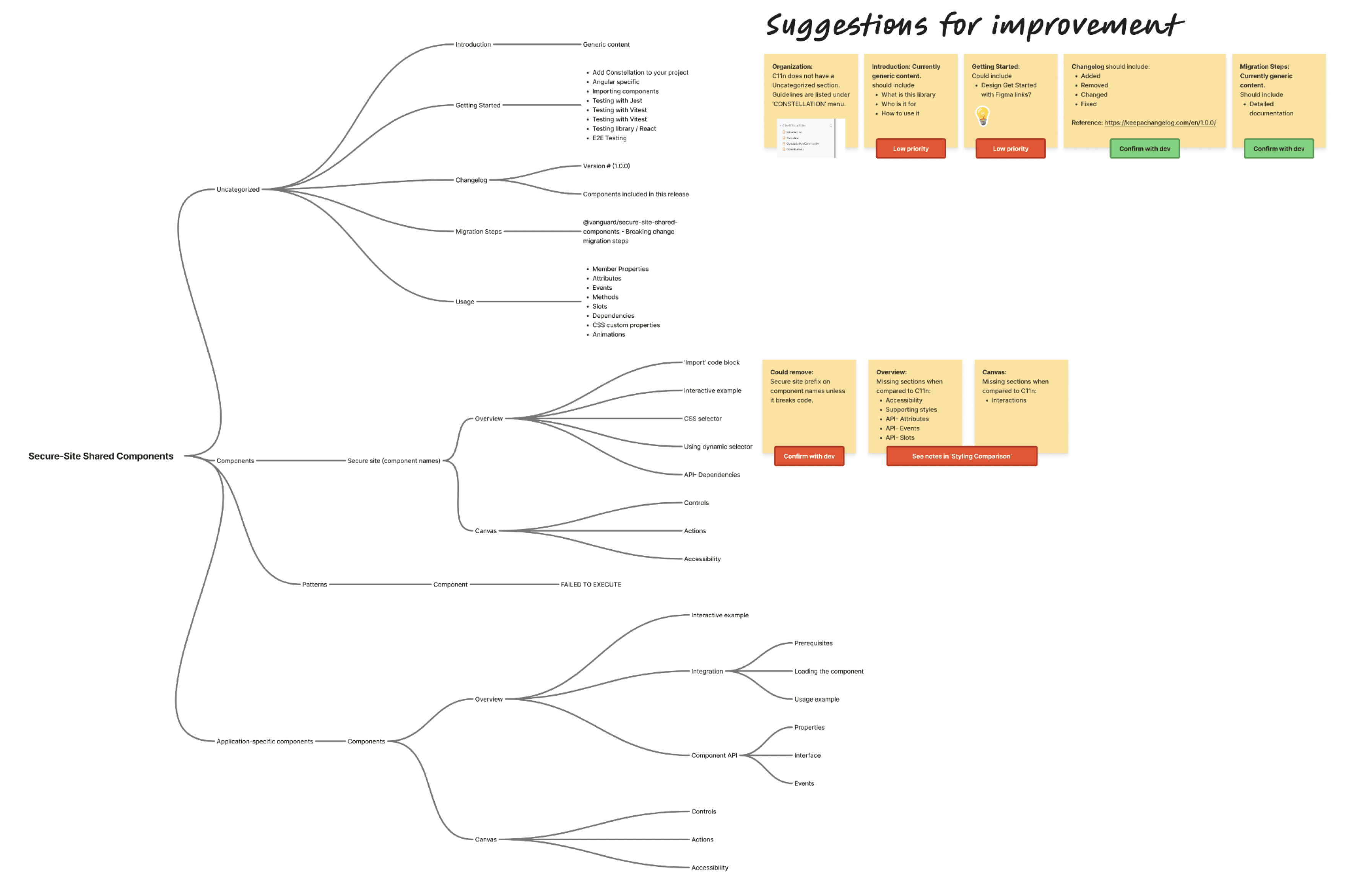
Storybook components audit and suggestions
4.Component refactor
I reviewed every component in the secure site Figma library against Constellation’s guidelines and used what I found to plan the refactor. My work included:
Removing bloat by cutting duplicate properties and redundant variants
Remapping variable connections from deprecated Angular variables to approved semantic ones
Renaming components to match Constellation’s taxonomy
Using Figma features like modes, slots and boolean properties to make components more efficient
Replacing raw values with Constellation semantic tokens across the library

Refactored component with guidelines
5. Testing
The library had never been tested before, so components behaved inconsistently across projects. I introduced stress testing based on Constellation guidelines. It covered:
Properties: Building every possible variant matrix. I did this by hand at first, then automated it with a custom Claude skill that works with the Figma MCP server.
Content: Testing long text to check wrapping, plus single-character and empty states to catch edge cases and behaved as expected.
Spacing: Measuring margins and padding with Figma’s measure tool and annotating behaviors for developer documentation.
Layout: Testing components in inline, inline-wrap, stack and grid layouts.
Specifications: Generating specs with the Spectacular plugin so engineers could find documentation easily.

Component testing sections
AI adoption
I incorporated Claude, Claude Code, Figma MCP and Microsoft 365 Copilot into the Secure Site design system workflow to cut down on repetitive manual work and make governance easier to scale.
AI assisted in:
Component audits
Variable and library compliance
Naming checks
Content, scaling and spacing stress tests
Documentation
Meeting notes and team updates
Component reviews dropped from about 32 minutes to 24, a 25% time saving. Across 220 components, that’s roughly 30 hours saved. Final design system decisions still went through human reviews.

Claude code AI runs
Metrics
Reviewed Figma library analytics to measure impact
Tracked component usage and inserts
Held regular check-ins with designers and developers to find ways to improve the library
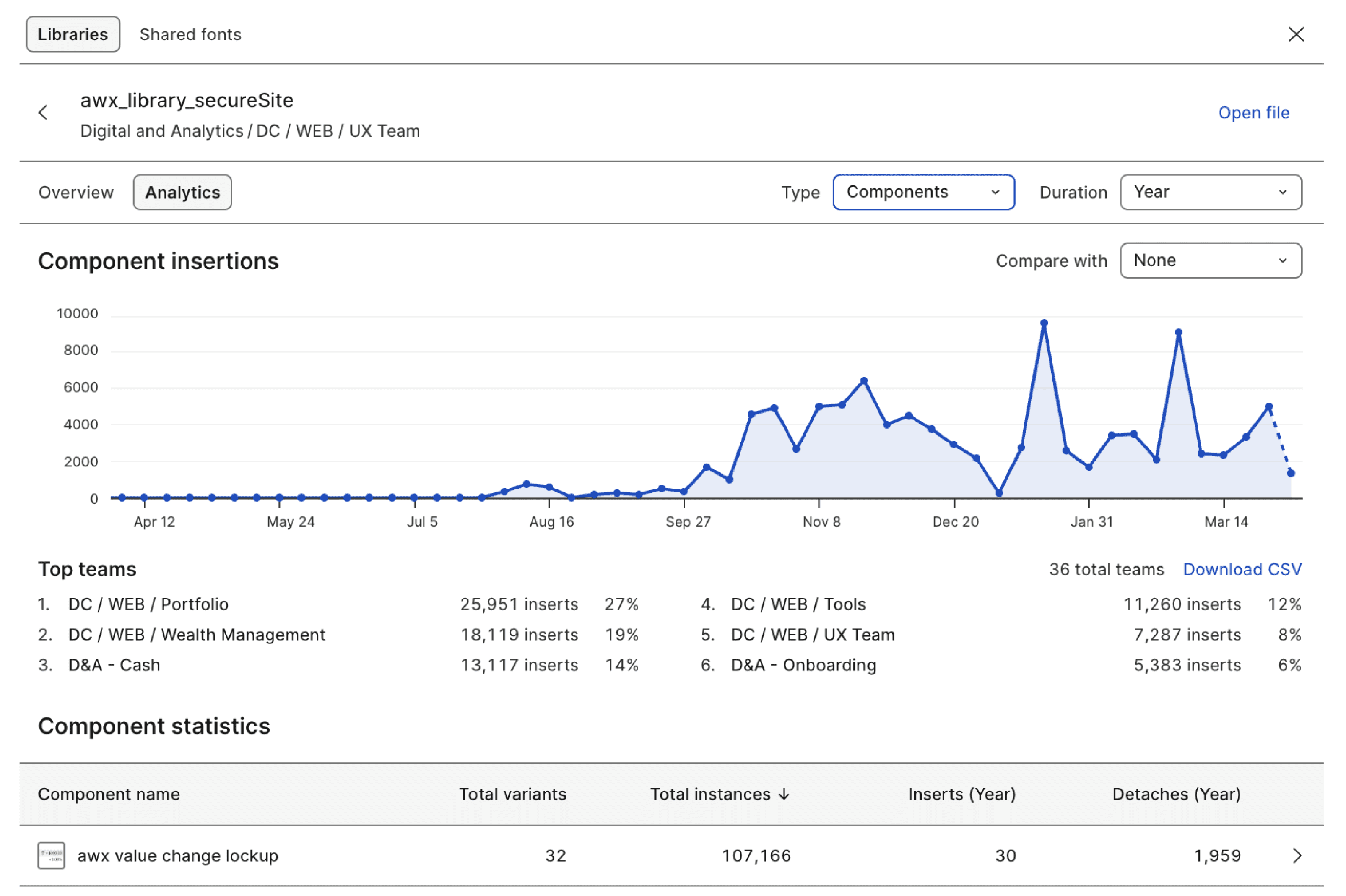
Figma library usage analytics
Impact
220+ components refactored.
2000+ inserts per week for over 51 teams.
Comprehensive documentation and testing
Aligning the design library with development artifacts.
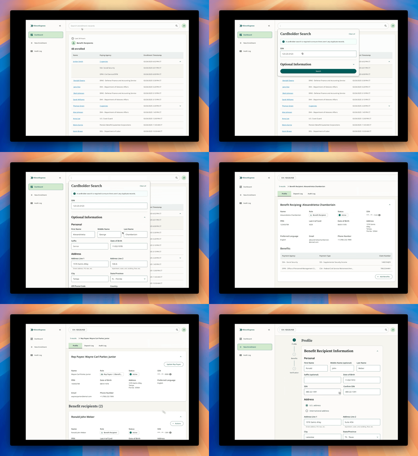

Enter Password
Hint: For the password, just send me an email at: ashwinjoseux@gmail.com